The Red Thread Project
 When Lindsay Obermeyer came to me, she was asking for a simple illustration. She had been working on The Red Thread Project for a while, and wanted some way to show what it was all about. In speaking with her found out that the Red Thread Project was more than just knitting hats for various causes (cancer, homeless shelters, hospitals) -- it was an installation that took place in cities across the US. People knit their hats and then got together to support each other and their causes, and to raise awareness by connecting them all with a red chord.
It became pretty apparent to me that she needed way more than an illustration. So I asked her if I could do a logo and some various stuff, and just see what she thought. Give her some materials to use when she presented to cancer societies and hospital boards, so she looked legit and they'd take her project serious.
And she said yes. Below are the results:
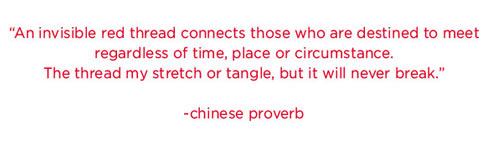
The Red Thread Project all started with this quote:
The quote for me was a good jumping ground to something visual to represent the project. So I started sketching ideas. LOTS of ideas. Lots of sketching and fiddling. And finally narrowed it down to this mark:
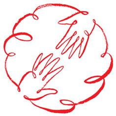
To me, this mark shows the human aspect of this project: the two hands reaching for each other... supporting and pulling each other up. And then they are also connected and "one" in a red thread that never breaks (taken from the quote).
After settling on a mark, the logo itself came pretty quickly. I knew I wanted to do something a little traditional because of the audience Lindsay would be showing it to mainly (hospitals, boards of directors, etc), but I wanted it to still be fun and playful, like the nature of the project. So here's the type I chose:
![]()
I played to the corporate side by having the type be centered and the traditional placement of the mark over the type. And the type treatment itself is slightly reminiscent of storybook type, to get to the playful side.
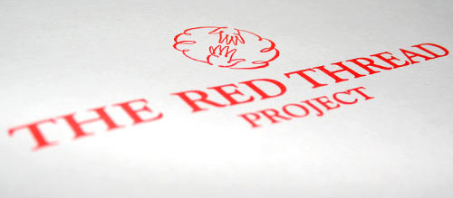
Here's what it looks like in non-vector format:
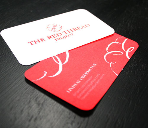
After the logo was in place, the supporting materials came next. Business cards:
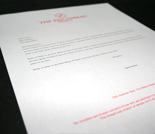
Letterhead:
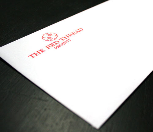
Business envelope:
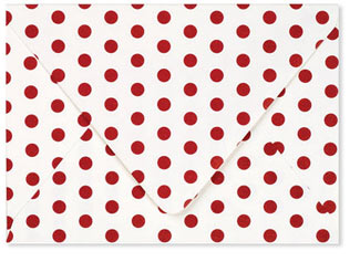
And fun envelope for participant correspondence:
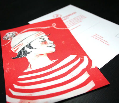
And then, finally, the illustration... The illustration was placed on postcards to be mailed as a call to participate as well as for gaining exposure in the cities. Because it was to be mailed out to individuals, I thought it made sense to show ONE person, in a happy state, with a hat on. Her arms reach out, like the cord attached to her hat, as if she's holding hands with the people on either side of her. So it shows the difference one person can make, but also shows her as part of a community. Here's how it turned out:
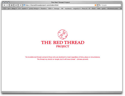
And last but not least, a website direction (still in the works):
Lindsay was thrilled with the results, and said she felt a lot more confident going into meetings with these materials to support her.
Thank you, Lindsay, for asking me initially, and for being so wonderful to work with. :)